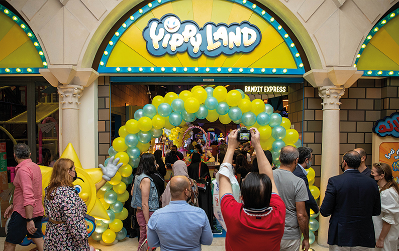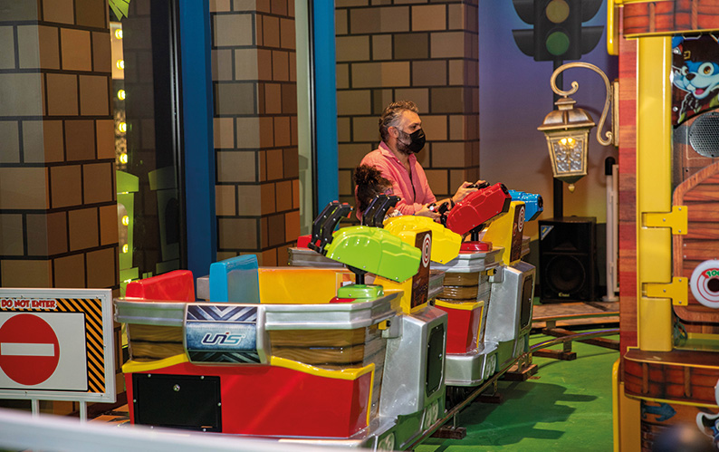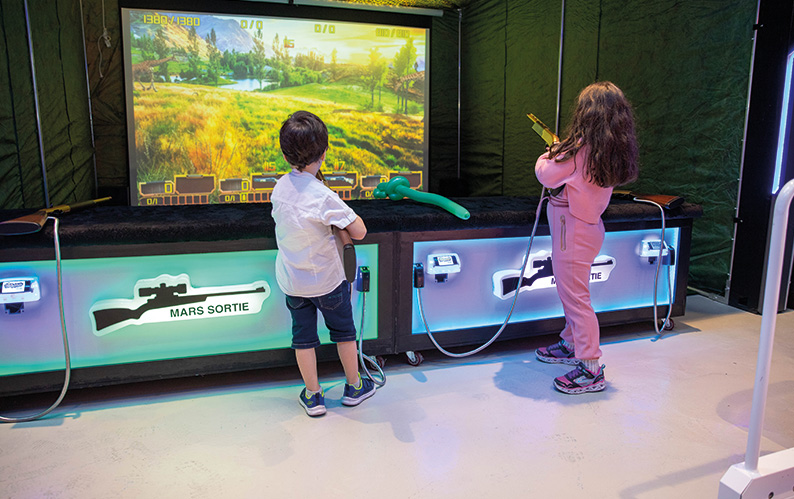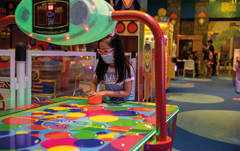
The concept intent for the facility is filled with fantasy and playfulness with adesign language that is intended to appeal to the younger (2-12 years) audience. The interior design elements and details that make up the ambiance for the facility is inspired from children’s’ toys and the fun-quirky delights that embellish a child’s imagination. The brand name YIPPYLAND. Thus, ideations are derived from the denotation of the word ‘Yippy’ / ‘Yippee’ which is an expression of excitement, surprise and delight. These ideas were translated to the interior architecture by designing a variety of elements that evoke such emotions to children, thus, creating an ambiance that is both fascinating and engaging. The visual experience starts as one approaches the facility, being welcomed by a bright colorful entrance facade. The back-lit 3D signage bands, in both English and Arabic are placed on the three main sides of the facade framed by cabochon lights that will add visual dynamism to the facility and a design motif that complements the overall brand intent. Attractive entrance portals are designed taking into consideration overall sight lines from the food court.
